


Another New Task just completed....
This is really intriguing...
Here is what was given...
*Work on a Health/Disease Insight Analysis. You are to work on any two of the following diseases; Covid-19, Hepatitis, Malaria, Lassa fever, Cholera, or HIV/AIDs. You are to scrap, clean, and visualize data using Power BI and create a Disease and Infection Monitoring Dashboard.
Your dashboard must show these data: Infected Demographic by Sex Infected Demographic by age range Reported cases by date Affected locations heatmap Mortality by type Mortality by region Mortality by sex Mortality by age range Mortality rate Total death *
After toiling, for what seems like ages, we couldn't get a dataset that has all these... Well, we didn't relent. We had to improvise so as to still arrive at our desired goal.
So, here is the step by step guide we took to arrive at our destination. Firstly, we considered working with a dataset from a reputable body, specifically, HEALTH. Also, we thought it wise working with a dataset that has real essence, which led us to settle with a dataset for Covid-19 and Malaria.
Scraping the data was the next line of action. Due to the data we consider working with, it has already been scrapped, and was found on Kaggle, one of the biggest platform, if not the largest, for finding real-time data to work with.
The work just began...
Data Cleaning. This part seems to be the most time consuming task, as it involves carrying out different task on the data. And if it's not rightly done, it will lead to making the data not usable.
We had taken our time in preparing the data for Visualization.
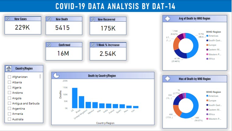
Finally, for the visualization, we had two pie chart,
- Average of Death by WHO region.
- Max of Death by WHO region..
And a Bar chart that shows the Death by Country, with USA topping the league.
- Five Card Visual
- One list
PS: We disconnected the connection between the two pie chart and bar chart from the list. That is, even if a country is selected, the pie chart and Bar chart remains unchanged.
We're glad to share with you the link to our dashboard.
 PS: Only dedicated software can access the file..