Analysis of telecoms subscriptions made in Nigeria in Q4 of 2018 using MS Excel and Power BI


The Task
Data analysis has been an area of interest in recent times, according to Wikipedia, data analysis is a process of inspecting, cleansing, transforming, and modeling data with the goal of discovering useful information, informing conclusions, and supporting decision-making.
Data Analytics Team (DAT-14) had her first task in the data analysis Bootcamp, to source a dataset of our choice and make a product sales analysis.
It was a bit difficult getting the dataset of our choice but then, we came across a telecommunication subscription made by Nigerians between November to December of 2018.
The task featured Data Scraping, Data Cleaning, and Data Visualization. In the analysis, I could answer the following questions
- Total no. of subscriptions made in that time
- Distinguishing the type of subscriptions made in that time
- Top ten states where subscriptions were made
- Which service provider had the most subscribers?
- Which state will provide the highest revenue from subscription sales?
The Analysis...
The tools used to generate our insight and carry out our analysis are
- MS Excel
- Power BI
Excel
The processes involved during analysis of the data with excel include,
Data Cleaning: From the data gathered, the "mobile network" column had EMTS/9MOBILE, which made it a bit difficult in filtering, so it was replaced with EMTS only.
37 Recorded Macros and 37 Button: We recorded 37 macro, each assigned to a state, and attach a button to it. Specifically, these macros and button works like a filter, so if for example, Abia state button is clicked, it will filter out all the data for Abia state only. Same for other state.
Data Visualization: Using a Pie chart, we analyze the network with Highest number of subscription.
Power BI
The Microsoft power bi tool was used to carry out this mini analysis.
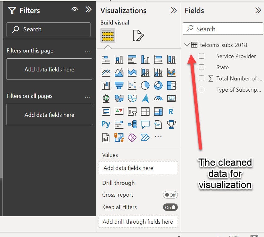
First, I transformed and cleaned the data on the power query editor and ensured my dataset was in good shape and ready to be visualized.
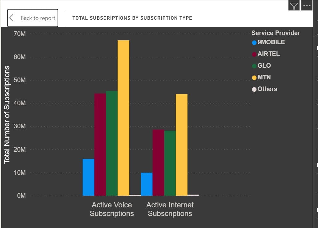
There are two subscription types discovered in the dataset (Active Voice subscription and Active internet subscription). The clustered column, clustered bar charts, and cards were the favorites to make it to my canvas. The clustered column chart was used to represent the total subscriptions by subscription type.
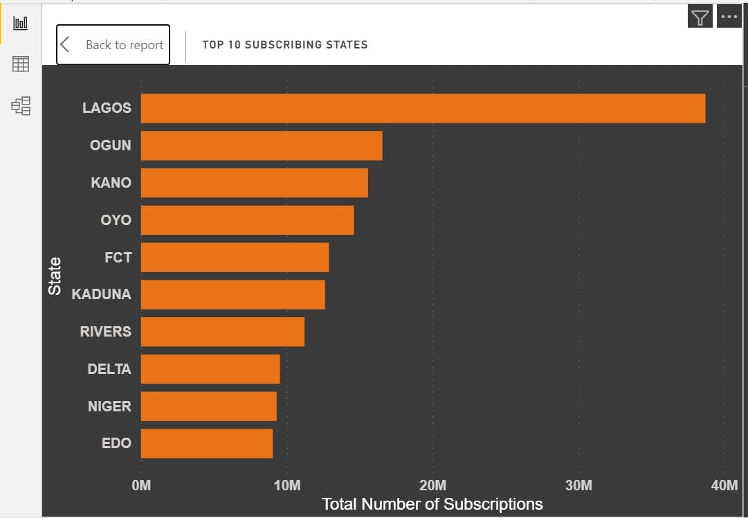
Then the clustered bar chart represents the top ten states where subscriptions were made.
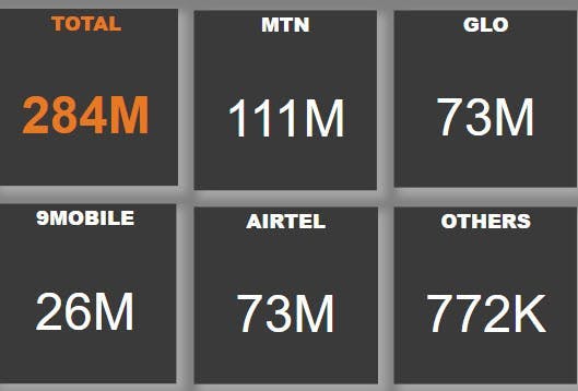
Finally, the cards represent the total subscriptions made and I further used them to split the total subscriptions by the service providers as shown in the image below:
Insights:
It is safe to say that, for more revenue generation and profits, service providers should target Lagos, since it promises a large number of subscriptions.
MTN is the most subscribed network for both voice and internet subscriptions.
In Q4 of 2018, users subscribed more for voice calls than they did for Internet subscriptions, which can also be deduced that there were more calls than internet browsing in that period.
Extra This dataset can be drilled further to find out the state with the lowest subscriptions. Note that Q4 stands for Quarter 4 or Fourth Quarter. Like and drop a comment below.
Here are the link to the files Excel >> drive.google.com/folderview?id=1p-0vIFfgGQu..
Power BI >> drive.google.com/drive/folders/1AooKvhvRipD..